In general files should be provided to us at their finished size (plus bleeds when applicable).
Saddle-stitched books should be provided in 1 PDF, as single pages, in page order (No spreads please).
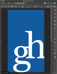
For example, an 3.5×2″ business card should have a page size (or document size) of 3.5×2″ (for no bleeds) or 3.625×2.125″ (with bleeds). Notice how the example does not include any templates lines, crop marks or printer marks. These things are not needed and often end up on the final product if not removed.
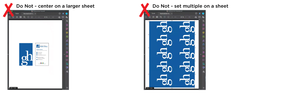
Files that are sent multiple up on a sheet will incur a design fee.
Preferred Programs
| PDF PDF/x-1a:2001 | InDesign CS or newer (Packaged) | Illustrator CS or newer Fonts outlined & images embedded | Photoshop CS or newer |
Accepted Programs (With Additional Charges)
There will be a design charge for converting these file formats to a PDF. We cannot be responsible for any formatting or conversion issues that may occur when converting files to a PDF.
|
|
|---|---|
| Microsoft Word Include Images in File | Publisher |
Notes on supplying native files
If you choose to supply the live files instead of a PDF please be sure to include any images or fonts that are
used. We cannot output a file unless we have the art/photos and fonts used within the document intended
for output.
Packaging Files (Adobe InDesign) – Adobe InDesign has a package feature to collect all of your pictures used, as well as fonts.
- First, check your links palette to make sure that all of your pictures are updated and not missing. Address any “stop sign” or “caution sign” symbols.
- Choose file, select package, then follow the on screen instructions, and be sure that the pictures, fonts, and update links options are checked.
- Please use Stuffit or Zip to compress the folder before uploading.
Adobe Illustrator– Make sure all images are embedded and fonts are converted to outlines
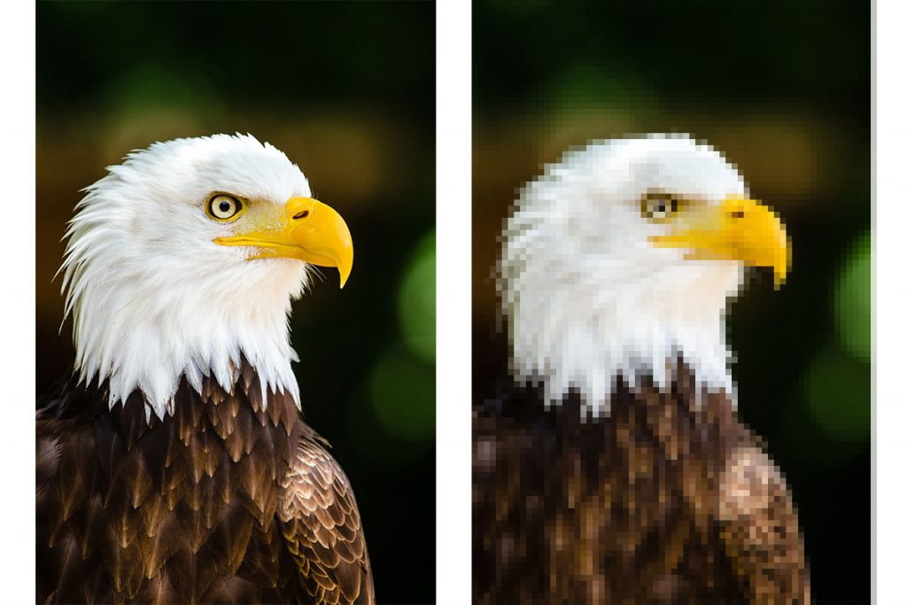
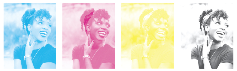
300dpi is the recommended resolution
The more dots/pixels the image contains, the sharper the image will print. As a result, printing may look blurry if a 72dpi image is used as compared to using a 300dpi image. For example, the left image below is at 300dpi and the image on the right is at 72dpi.
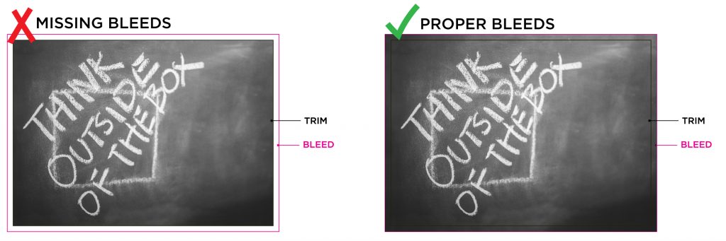
What is a “bleed”?
If your artwork intentionally has elements or backgrounds that run right to the edge then those could be considered bleed items. To properly achieve this effect on a printed product and ensure there is no white border the element or background must extend beyond the final trim size.
Art Requirements
Bleed items must extend 1/16” past the trim on each side. For example, an 8.5 x 11” finished product with bleed items would actual be set up at 8.625 x 11.125”, to account for a 1/16” bleed on each side.
Special bleed requirements
Pocket Schedules/Brochures: 1/8″ on the left and right – 1/16″ on the top and bottom
Perfect Bound Booklets: 1/8″ bleed on each side
Die Cut Products: 1/8″ bleed on each side
How to set up bleeds
| CLICK HERE for InDesign Tutorial | |
| CLICK HERE for Publisher Tutorial |
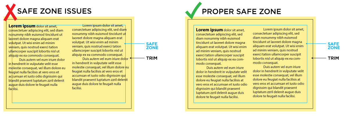
What is the “safe zone”?
The safe zone is an area slightly smaller than the size of your final trim.The purpose is to ensure that critical design elements are not going to be cut off during the finishing process. It also keeps important content at a readable distance from the center fold on booklets or other folded products.
Art Requirements
On most products, non-bleed items must be 1/8″ away from the trim.
Special safe zone requirements
One Color Prints: 5/16″ safe zone
Booklets: 3/16″ safe zone
Why are borders a potential issue?
The challenge with borders is that they can look uneven or off-center if the cut is not absolutely perfect on each piece. While we pride ourselves in having very accurate cuts artwork should still allow for a small amount of cut tolerance to yield the best looking product. Take a look at the image below.
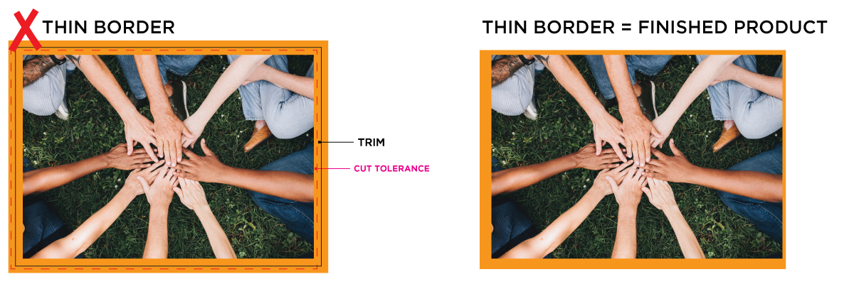
Black border = intended cut line
Dashed pink line = the cutting tolerance
The pink border shows how cutting can vary, and even the slightest amount can cause a thin border to look very uneven.
Art Requirements
Borders should be at least 1/4″ thick or if you have a thin border it should be 1/4″ away from the trim. Keeping a larger margin will help maintain consistency on all sides of the product.
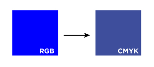
CMYK Color Mode
All files should be provided in CMYK mode (unless we are running a spot color)
What happens if RGB files are provided?
When we receive RGB images or files, our system will do a standard-value conversion to CMYK, which may not be perfectly to your liking. We cannot be responsible for results if you furnish your images with RGB.
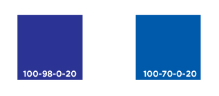
Avoiding purple-ish blues
First, be sure to supply your files in CMYK. Often times a bright RGB blue will convert to a purple blue when switched to CMYK.
Second, any CMYK mix that is high in magenta and high in cyan will print purple. If you want a more true blue color we recommend keeping cyan and magenta 30% apart from each other to create a blue.
PANTONE Ink Color
Can my job be printed in Pantone ink?
Yes, we can print specific Pantone inks upon request. Please specify with your sales rep if your job requires a Pantone ink.
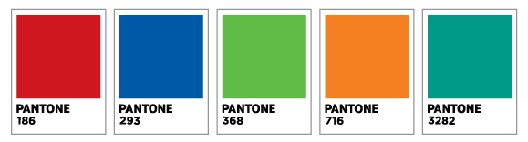
Can you match a Pantone without running the actual ink color?
Yes, we can do a CMYK match to your Pantone colors. We base our values on the Pantone Bridge book’s recommend mixes for the closest possible match. Please understand that not all Pantones colors convert to CMYK perfectly. Please let your sales rep know if your artwork requires a Pantone match.
What happens if artwork has Pantones or Spot colors in it but is running CMYK?
If you use Pantone/Spot colors in a job that will print CMYK and you do not specify the need for a Pantone match, our system will convert the artwork to CMYK. The results of the standard conversion are not always a perfect match to the Pantone and the results are not always what customers expect. That’s why we highly recommend that customers convert all their files to CMYK before uploading their art. GH is not responsible for product that has experienced a color shift during the conversion to CMYK format.
Black vs Rich Black
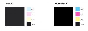
When to use rich black
Any time artwork has a large solid area of black a rich black mix should be used for uniform ink coverage. Rich black is even recommended for large bold headline text.
Our rich black mix is: 30% Cyan, 30% Magenta, 10% Yellow, 100% Black
Please note that using a heavier mix (like 100% of all colors) can have the reverse effect and cause heavy ink coverage and lead to smearing.
When rich black should NOT be used
If your artwork has small text or thin lines then a CMYK mix of 0 Cyan, 0 Magenta, 0 Yellow, 100 Black should be used for the best results.
In offset printing there can be minuscule variations in plate registration and it can cause slight color shadows (or ghosting). Ghosting is the most noticeable on thin delicate lines and small text. If 1-color black is used instead then only a single plate is needed and the possibility of ghosting is eliminated.
Sometimes using shadows, glows or other transparency effects on top of a spot color creates white boxes or other unwanted results.
The best way to avoid issues like this is to convert all spot colors to CMYK before sending artwork in or flattening all transparencies
